Introductions
Previously, I’ve written one article on how to build a reusable vuejs modal, and it was one year ago. I'm grateful that many people read it, although it's a little bit too beginner. Today, I would like to teach you guys how to build a reusable vuejs modal but with some advanced features.
What we’re going to build is a reusable modal component with multiple support.
- Component-based
- Render in the root DOM
- Using slot to render the content
- An option to add a scrollable content
- Press escape key to exit the modal
- Animation transition
Let’s dive into how to build it.
Build a template HTML/CSS
First of all, let’s create a new file for our modal component and called it BaseModal.vue
Since, I’ve prepared some template to work on in HTML and CSS, Let’s add it on our modal component and render it in our page.
    <div
      class="fixed bottom-0 inset-x-0 px-4 pb-4 sm:inset-0 sm:flex sm:items-center sm:justify-center"
    >
      <div class="fixed inset-0 transition-opacity">
        <div
          class="absolute inset-0 bg-gray-500 opacity-75"
        ></div>
      </div>

      <div
        class="z-10 bg-white rounded-lg overflow-hidden shadow-xl transform transition-all sm:max-w-lg sm:w-full"
        role="dialog"
        aria-modal="true"
        aria-labelledby="modal-headline"
      >
        <div class="bg-white px-4 pt-4 pb-4 sm:p-5 sm:pb-5">
          <div class="sm:flex sm:items-start">
            <div class="mt-3 text-center sm:mt-0 sm:ml-4 sm:text-left">
              <div class="flex items-center justify-between mb-4">
                <h3
                  class="text-lg leading-6 font-medium text-gray-900"
                  id="modal-headline"
                >
                  Card Title
                </h3>
                <button>
                  <svg class="h-5 w-5" fill="currentColor" viewBox="0 0 20 20">
                    <path
                      fill-rule="evenodd"
                      d="M4.293 4.293a1 1 0 011.414 0L10 8.586l4.293-4.293a1 1 0 111.414 1.414L11.414 10l4.293 4.293a1 1 0 01-1.414 1.414L10 11.414l-4.293 4.293a1 1 0 01-1.414-1.414L8.586 10 4.293 5.707a1 1 0 010-1.414z"
                      clip-rule="evenodd"
                    ></path>
                  </svg>
                </button>
              </div>
              <div class="mt-2">
                Card Body
              </div>
            </div>
          </div>
        </div>
        <div class="bg-gray-50 px-4 py-6 sm:px-6 sm:flex sm:flex-row-reverse">
          <span class="mt-3 flex w-full rounded-md shadow-sm sm:mt-0 sm:w-auto">
            <button
              type="button"
              class="inline-flex justify-center w-full rounded-md border border-gray-300 px-4 py-2 bg-white text-base leading-6 font-medium text-gray-700 shadow-sm hover:text-gray-500 focus:outline-none focus:border-blue-300 focus:shadow-outline-blue transition ease-in-out duration-150 sm:text-sm sm:leading-5"
            >
              Cancel
            </button>
          </span>
        </div>
      </div>
    </div>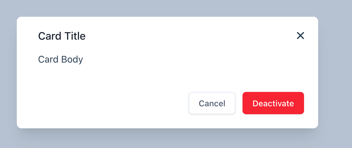
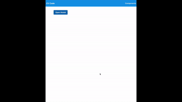
Create a button to trigger the modal
Cool. Let’s add a method to control the visibility of the modal. I'm going to add a new button with the methods openModal and add a new state call this.isShowModal . Whenever the user clicks the button, it will reverse the isModalOpen value.
    <template>
    	<button @click="toggleModal">Open Modal</button>
    	<base-modal v-if="isShowModal"/>
    </template>

    <script>
    import BaseModal from "../components/BaseModal";
    export default {
      components: {BaseModal},
      data: () => ({
        isShowModal: false
      }),
      methods: {
        toggleModal() {
          this.isShowModal = !this.isShowModal;
        }
      }
    };
    </script>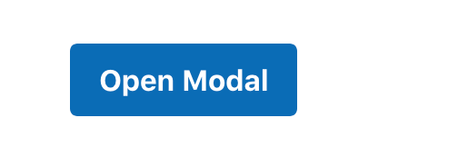
Cool. So let’s add a way to close the modal. We want when the user presses the x mark or the cancel button, it will close the modal.
In the modal component, add a new method called handleClose, it will trigger the parent that listens to close listener.
    methods: {
        handleClose() {
          this.$emit("close");
        }
    }
In the container component, we will add the listener call close, and it will trigger the toggleModal method that we built just now.
<base-modal v-if="isShowModal" @close="toggleModal"/>
Use Vue Portal
It seems like everything was working smoothly. To make it more flexible, let’s render this modal outside of the container DOM. Since we’re dealing with absolute position, give reduce the friction to render it.
We’re going to use a library call vue portal - GitHub - LinusBorg/portal-vue: A feature-rich Portal Plugin for Vuejs, for rendering DOM outside of a component, anywhere our app or the entire document.
Let’s install vue-portal
    npm i portal-vue

    yarn add portal-vue
Add the dependency in your main.js
    import PortalVue from 'portal-vue'
    Vue.use(PortalVue)
Add the portal to the location where do you want the modal to be rendered. In this case, I’m going to render it inside the root Vue component - App.vue
    <div id="app" class="font-sans">
      <router-view></router-view>
      <portal-target name="modal"/>
    </div>
To use it, wrap our modal component with <portal-target></portal-target>
    <portal to="modal">
    	...modal element here
    </portal>
Now, our modal has been rendered inside the portal. Isn’t it's so cool 😎
Add Properties support
Let’s add the props support to our modal. As a developer, I want this modal component able to change the modal title and the content inside it.
Let's add the props argument in our modal component.
    export default {
    	props: {
      	title: {
        		type: String,
        		required: true
      	}
    	}
    }
To use it, pass the
<base-modal v-if="isShowModal" @close="toggleModal" title="Modal Title"></base-modal>Slot
Now, we want to show the content inside the modal body—the way we want to do it by using the slot. There are two slots; we’re going to use it.
- Modal Body
- Modal Footer
We want the modal to preview any content inside the body and add a functionality for the submit button. We will use <slot></slot> for the modal body and <slot name="footer"></slot> for the modal footer.
    <template>
        <div
          class="fixed bottom-0 inset-x-0 px-4 pb-4 sm:inset-0 sm:flex sm:items-center sm:justify-center"
        >
          <div class="fixed inset-0 transition-opacity">
            <div
              @click.self.stop.prevent="handleClose"
              class="absolute inset-0 bg-gray-500 opacity-75"
            ></div>
          </div>

          <div
            class="z-10 bg-white rounded-lg overflow-hidden shadow-xl transform transition-all sm:max-w-lg sm:w-full"
            role="dialog"
            aria-modal="true"
            aria-labelledby="modal-headline"
          >
            <div class="bg-white px-4 pt-4 pb-4 sm:p-5 sm:pb-5">
              <div class="sm:flex sm:items-start">
                <div class="mt-3 text-center sm:mt-0 sm:ml-4 sm:text-left">
                  <div class="flex items-center justify-between mb-4">
                    <h3
                      class="text-lg leading-6 font-medium text-gray-900"
                      id="modal-headline"
                    >
                      {{ title }}
                    </h3>
                    <button @click.prevent="handleClose">
                      <svg class="h-5 w-5" fill="currentColor" viewBox="0 0 20 20">
                        <path
                          fill-rule="evenodd"
                          d="M4.293 4.293a1 1 0 011.414 0L10 8.586l4.293-4.293a1 1 0 111.414 1.414L11.414 10l4.293 4.293a1 1 0 01-1.414 1.414L10 11.414l-4.293 4.293a1 1 0 01-1.414-1.414L8.586 10 4.293 5.707a1 1 0 010-1.414z"
                          clip-rule="evenodd"
                        ></path>
                      </svg>
                    </button>
                  </div>
                  <div class="mt-2">
                    <slot />
                  </div>
                </div>
              </div>
            </div>
            <div class="bg-gray-50 px-4 py-6 sm:px-6 sm:flex sm:flex-row-reverse">
              <slot name="footer"></slot>
              <span class="mt-3 flex w-full rounded-md shadow-sm sm:mt-0 sm:w-auto">
                <button
                  @click.prevent="handleClose"
                  type="button"
                  class="inline-flex justify-center w-full rounded-md border border-gray-300 px-4 py-2 bg-white text-base leading-6 font-medium text-gray-700 shadow-sm hover:text-gray-500 focus:outline-none focus:border-blue-300 focus:shadow-outline-blue transition ease-in-out duration-150 sm:text-sm sm:leading-5"
                >
                  Cancel
                </button>
              </span>
            </div>
          </div>
        </div>
    </template>
To use it, we just pass the content in the <base-modal> component like this.
        <base-modal v-if="isShowModal" @close="toggleModal" title="Modal Title">
          <p class="text-sm leading-5 text-gray-500">
            Modal <strong>Body</strong>
          </p>
          <template v-slot:footer>
            <span class="flex w-full rounded-md shadow-sm sm:ml-3 sm:w-auto">
              <button
                type="button"
                class="inline-flex justify-center w-full rounded-md border border-transparent px-4 py-2 bg-red-600 text-base leading-6 font-medium text-white shadow-sm hover:bg-red-500 focus:outline-none focus:border-red-700 focus:shadow-outline-red transition ease-in-out duration-150 sm:text-sm sm:leading-5"
              >Deactivate</button>
            </span>
          </template>
        </base-modal>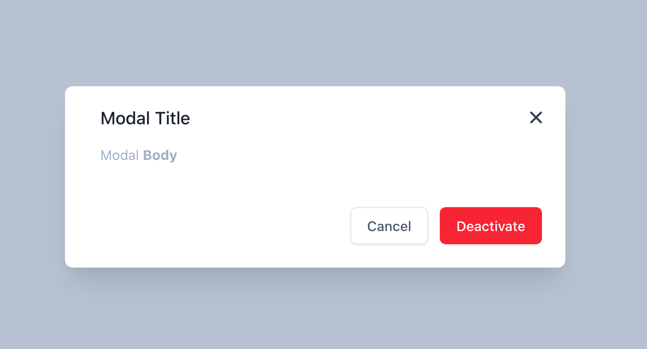
Scrollable
Now, we have a functional modal component. Let assume our content page is going to so long. So, we want to add some functionality to add scrollable options.
In the modal component, let’s add a new props call scrollable with a Boolean data type and set it as default value as a false.
      props: {
        title: {
          type: String,
          required: true,
        },
        scrollable: {
          type: Boolean,
          default: false,
        },
      }
Let’s add a new styling for scrollable content. I’m going to add this class called .scrollable
    .scrollable {
      height: 300px;
      overflow-y: scroll;
    }
To use it, we are going to check for the scrollable properties. If the scrollable is true, then we are going to add this class to our content. We are going to use class binding to achieve it.
    <div class="mt-2" :class="{ 'scrollable': scrollable }">
    	<slot />
    </div>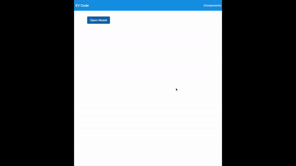
Cool. Now, we can add a long content in the slot with the scrollable props too. It's working correctly 👏🏻.
Keyboard Binding
Let’s add another power feature. We wanna close this modal if we pressed the escape key.
First, we need to listen to an event with a keyboard pressed. So, in the modal component, let’s add it in the created and destroyed lifecycle.
      created() {
        document.addEventListener("keyup", this.onClose);
      },
      destroyed() {
        document.removeEventListener("keyup", this.onClose);
      }
Don’t forget to remove the listener when we didn’t use it. What’s happens here is whenever the keyup is trigger, it will be called a method called onClose. Let’s add this method.
      methods: {
        handleClose() {
          this.$emit("close");
        },
        onClose(event) {
          // Escape key
          if (event.keyCode === 27) {
            this.handleClose();
          }
        }
We can read the event by using the event parameter. Since escape key button is 27 then, we are going to filter it. If the keycode is 27, then it will trigger the handleClose methods, which are to close our modal.
Transition
Let’s add a nice transition when we open and close the modal. Luckily, Vue already has a transition element, and we’re going to use it. Just wrap the modal component with the <transition name=“fade”></transition>
    <template>
      <portal to="modal">
        <transition name="fade">
    		...
        </transition>
      </portal>
    </template>
Add the fade CSS in the component too
    .fade-enter-active,
    .fade-leave-active {
      transition: opacity 0.25s ease-out;
    }

    .fade-enter,
    .fade-leave-to {
      opacity: 0;
    }
So, you will have a nice transition during open and close.
Source Code
BaseModal.vue
    <template>
      <portal to="modal">
        <transition name="fade">
          <div
            class="fixed bottom-0 inset-x-0 px-4 pb-4 sm:inset-0 sm:flex sm:items-center sm:justify-center"
          >
            <div class="fixed inset-0 transition-opacity">
              <div
                @click.self.stop.prevent="handleClose"
                class="absolute inset-0 bg-gray-500 opacity-75"
              ></div>
            </div>

            <div
              class="z-10 bg-white rounded-lg overflow-hidden shadow-xl transform transition-all sm:max-w-lg sm:w-full"
              role="dialog"
              aria-modal="true"
              aria-labelledby="modal-headline"
            >
              <div class="bg-white px-4 pt-4 pb-4 sm:p-5 sm:pb-5">
                <div class="sm:flex sm:items-start">
                  <div class="mt-3 w-full text-center sm:mt-0 sm:ml-4 sm:text-left">
                    <div class="flex items-center justify-between mb-4">
                      <h3
                        class="text-lg leading-6 font-medium text-gray-900"
                        id="modal-headline"
                      >{{ title }}</h3>
                      <button @click.prevent="handleClose">
                        <svg class="h-5 w-5" fill="currentColor" viewBox="0 0 20 20">
                          <path
                            fill-rule="evenodd"
                            d="M4.293 4.293a1 1 0 011.414 0L10 8.586l4.293-4.293a1 1 0 111.414 1.414L11.414 10l4.293 4.293a1 1 0 01-1.414 1.414L10 11.414l-4.293 4.293a1 1 0 01-1.414-1.414L8.586 10 4.293 5.707a1 1 0 010-1.414z"
                            clip-rule="evenodd"
                          />
                        </svg>
                      </button>
                    </div>
                    <div class="mt-2" :class="{ 'scrollable': scrollable }">
                      <slot />
                    </div>
                  </div>
                </div>
              </div>
              <div class="bg-gray-50 px-4 py-6 sm:px-6 sm:flex sm:flex-row-reverse">
                <slot name="footer"></slot>
                <span class="mt-3 flex w-full rounded-md shadow-sm sm:mt-0 sm:w-auto">
                  <button
                    @click.prevent="handleClose"
                    type="button"
                    class="inline-flex justify-center w-full rounded-md border border-gray-300 px-4 py-2 bg-white text-base leading-6 font-medium text-gray-700 shadow-sm hover:text-gray-500 focus:outline-none focus:border-blue-300 focus:shadow-outline-blue transition ease-in-out duration-150 sm:text-sm sm:leading-5"
                  >Cancel</button>
                </span>
              </div>
            </div>
          </div>
        </transition>
      </portal>
    </template>

    <script>
    export default {
      name: "BaseModal",
      props: {
        title: {
          type: String,
          required: true,
        },
        scrollable: {
          type: Boolean,
          default: false,
        },
      },
      created() {
        document.addEventListener("keyup", this.onClose);
      },
      destroyed() {
        document.removeEventListener("keyup", this.onClose);
      },
      methods: {
        handleClose() {
          this.$emit("close");
        },
        onClose(event) {
          // Escape key
          if (event.keyCode === 27) {
            this.handleClose();
          }
        },
      },
    };
    </script>

    <style scoped>
    .scrollable {
      height: 300px;
      overflow-y: scroll;
    }

    .fade-enter-active,
    .fade-leave-active {
      transition: opacity 0.25s ease-out;
    }

    .fade-enter,
    .fade-leave-to {
      opacity: 0;
    }
    </style>
App.vue
    <template>
      <div>
        <base-modal v-if="isShowModal" @close="toggleModal" scrollable title="Modal Title">
          <p class="text-sm leading-5 text-gray-500">
            Lorem Ipsum is simply dummy text of the printing and typesetting industry. Lorem Ipsum has been the industry's standard dummy text ever since the 1500s, when an unknown printer took a galley of type and scrambled it to make a type specimen book. It has survived not only five centuries, but also the leap into electronic typesetting, remaining essentially unchanged. It was popularised in the 1960s with the release of Letraset sheets containing Lorem Ipsum passages, and more recently with desktop publishing software like Aldus PageMaker including versions of Lorem Ipsum.
            Lorem Ipsum is simply dummy text of the printing and typesetting industry. Lorem Ipsum has been the industry's standard dummy text ever since the 1500s, when an unknown printer took a galley of type and scrambled it to make a type specimen book. It has survived not only five centuries, but also the leap into electronic typesetting, remaining essentially unchanged. It was popularised in the 1960s with the release of Letraset sheets containing Lorem Ipsum passages, and more recently with desktop publishing software like Aldus PageMaker including versions of Lorem Ipsum.
            Lorem Ipsum is simply dummy text of the printing and typesetting industry. Lorem Ipsum has been the industry's standard dummy text ever since the 1500s, when an unknown printer took a galley of type and scrambled it to make a type specimen book. It has survived not only five centuries, but also the leap into electronic typesetting, remaining essentially unchanged. It was popularised in the 1960s with the release of Letraset sheets containing Lorem Ipsum passages, and more recently with desktop publishing software like Aldus PageMaker including versions of Lorem Ipsum.
            Lorem Ipsum is simply dummy text of the printing and typesetting industry. Lorem Ipsum has been the industry's standard dummy text ever since the 1500s, when an unknown printer took a galley of type and scrambled it to make a type specimen book. It has survived not only five centuries, but also the leap into electronic typesetting, remaining essentially unchanged. It was popularised in the 1960s with the release of Letraset sheets containing Lorem Ipsum passages, and more recently with desktop publishing software like Aldus PageMaker including versions of Lorem Ipsum.
          </p>
          <template v-slot:footer>
            <span class="flex w-full rounded-md shadow-sm sm:ml-3 sm:w-auto">
              <button
                type="button"
                class="inline-flex justify-center w-full rounded-md border border-transparent px-4 py-2 bg-red-600 text-base leading-6 font-medium text-white shadow-sm hover:bg-red-500 focus:outline-none focus:border-red-700 focus:shadow-outline-red transition ease-in-out duration-150 sm:text-sm sm:leading-5"
              >Deactivate</button>
            </span>
          </template>
        </base-modal>
        <base-button type="primary" @click="toggleModal">Open Modal</base-button>
      </div>
    </template>

    <script>
    import BaseModal from "../components/BaseModal";
    import BaseButton from "../components/BaseButton";
    export default {
      components: { BaseButton, BaseModal },
      data: () => ({
        isShowModal: false,
      }),
      methods: {
        toggleModal() {
          this.isShowModal = !this.isShowModal;
        },
      },
    };
    </script>

    <style scoped></style>
Let me know if you have any features you are interested in adding inside this modal or any idea for the next article. Feel free to reach out at @jakzaizzat