TailwindCSS is getting hype lately. It was a fresh CSS framework that really helps the developer to write a fast and maintainable CSS design.
Let me explain step by step how to make it works.
Create an input
Let’s start with the basic one. Let’s create a basic HTML input with the type checkbox and label element. I’ve added ID to in the input tag and for attributes in the label. Whenever I clicked the label, it will auto-select the input.
<div class="p-4">
  <div class="flex items-center mr-4 mb-2">
    <input type="checkbox" id="A3-yes" name="A3-confirmation" value="yes" />
    <label for="A3-yes" class="select-none">Yes</label>
  </div>
</div>
Hide our input tag
Let’s hide our input tag since we’re gonna use a custom design for it. Let set the size for the input too. Although the input doesn’t visible on the screen we still able to click it since it’s still rendered in the DOM.
<input
  type="checkbox"
  id="A3-yes"
  name="A3-confirmation"
  value="yes"
  class="opacity-0 absolute h-8 w-8"
/>
Create custom design
I want the design to have a bordered rectangle with an SVG icon inside it. Make sure to set the element size the same with the input tag as the previous step. We want the custom input to have the same position as our original input.
And set the SVG icon hidden as default. We want to show it, whenever the input is checked.
<div
  class="bg-white border-2 rounded-md border-blue-400 w-8 h-8 flex flex-shrink-0 justify-center items-center mr-2 focus-within:border-blue-500"
>
  <svg
    class="fill-current hidden w-3 h-3 text-blue-600 pointer-events-none"
    version="1.1"
    viewBox="0 0 17 12"
    xmlns="http://www.w3.org/2000/svg"
  >
    <g fill="none" fill-rule="evenodd">
      <g transform="translate(-9 -11)" fill="#1F73F1" fill-rule="nonzero">
        <path
          d="m25.576 11.414c0.56558 0.55188 0.56558 1.4439 0 1.9961l-9.404 9.176c-0.28213 0.27529-0.65247 0.41385-1.0228 0.41385-0.37034 0-0.74068-0.13855-1.0228-0.41385l-4.7019-4.588c-0.56584-0.55188-0.56584-1.4442 0-1.9961 0.56558-0.55214 1.4798-0.55214 2.0456 0l3.679 3.5899 8.3812-8.1779c0.56558-0.55214 1.4798-0.55214 2.0456 0z"
        />
      </g>
    </g>
  </svg>
</div>
Checkbox Conditional
Let’s show the icon whenever the input is checked. We can handle it using CSS siblings. Lets put the element side by side. The final HTML output would be like this.
<div class="p-4">
<div class="flex items-center mr-4 mb-2">
<input
type="checkbox"
id="A3-yes"
name="A3-confirmation"
value="yes"
class="opacity-0 absolute h-8 w-8"
/>
<div
class="bg-white border-2 rounded-md border-blue-400 w-8 h-8 flex flex-shrink-0 justify-center items-center mr-2 focus-within:border-blue-500"
>
<svg
class="fill-current hidden w-3 h-3 text-blue-600 pointer-events-none"
version="1.1"
viewBox="0 0 17 12"
xmlns="http://www.w3.org/2000/svg"
>
<g fill="none" fill-rule="evenodd">
<g transform="translate(-9 -11)" fill="#1F73F1" fill-rule="nonzero">
<path
d="m25.576 11.414c0.56558 0.55188 0.56558 1.4439 0 1.9961l-9.404 9.176c-0.28213 0.27529-0.65247 0.41385-1.0228 0.41385-0.37034 0-0.74068-0.13855-1.0228-0.41385l-4.7019-4.588c-0.56584-0.55188-0.56584-1.4442 0-1.9961 0.56558-0.55214 1.4798-0.55214 2.0456 0l3.679 3.5899 8.3812-8.1779c0.56558-0.55214 1.4798-0.55214 2.0456 0z"
/>
</g>
</g>
</svg>
</div>
<label for="A3-yes" class="select-none">Yes</label>
</div>
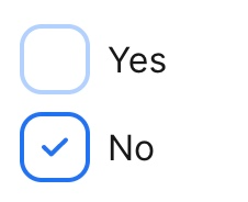
</div>Whenever the input was checked, it will changed the border color of the input and show the SVG icon (as a block).
input:checked + div {
  @apply border-blue-500;
}
input:checked + div svg {
  @apply block;
}
I used the tailwind @apply function here
Unfortunately, we still need to write a little bit if CSS to handle sibling selectors for checked attributes. If you still wanna use TailwindCSS, feel free to explore Tailwind variant on how to solve it — https://tailwindcss.com/docs/plugins#complex-variants
Congratulations, now it’s done. Feel free to play around with it at — https://play.tailwindcss.com/2tdJjb6CbD
Source Code
<div class="p-4">
  <div class="flex items-center mr-4 mb-2">
    <input
      type="checkbox"
      id="A3-yes"
      name="A3-confirmation"
      value="yes"
      class="opacity-0 absolute h-8 w-8"
    />
    <div
      class="bg-white border-2 rounded-md border-blue-400 w-8 h-8 flex flex-shrink-0 justify-center items-center mr-2 focus-within:border-blue-500"
    >
      <svg
        class="fill-current hidden w-3 h-3 text-blue-600 pointer-events-none"
        version="1.1"
        viewBox="0 0 17 12"
        xmlns="http://www.w3.org/2000/svg"
      >
        <g fill="none" fill-rule="evenodd">
          <g transform="translate(-9 -11)" fill="#1F73F1" fill-rule="nonzero">
            <path
              d="m25.576 11.414c0.56558 0.55188 0.56558 1.4439 0 1.9961l-9.404 9.176c-0.28213 0.27529-0.65247 0.41385-1.0228 0.41385-0.37034 0-0.74068-0.13855-1.0228-0.41385l-4.7019-4.588c-0.56584-0.55188-0.56584-1.4442 0-1.9961 0.56558-0.55214 1.4798-0.55214 2.0456 0l3.679 3.5899 8.3812-8.1779c0.56558-0.55214 1.4798-0.55214 2.0456 0z"
            />
          </g>
        </g>
      </svg>
    </div>
    <label for="A3-yes" class="select-none">Yes</label>
  </div>
</div>
@tailwind base;
@tailwind components;
@tailwind utilities;
input:checked + div {
@apply border-blue-500;
}
input:checked + div svg {
@apply block;
}